ARTIST TO ARTIST | ACRYLIC TECHNIQUES | ART NEWS | ALL POSTS

Friday, September 26, 2008

A Positive Look at Negative Space

Some of you might remember that well-worn phrase “positive-negative space” from art school days, representing the form and background in a painting. When I taught a basic drawing class many years ago I got a renewed interest in this concept. I noticed that our eyes could focus on positive space or negative space but not both at the same time. For instance, if you place your hand palm down on the table and spread your fingers out a bit, the fingers and hand are the positive space, and the space in between the fingers are negative space. Try it out. I can make my eyes focus on one or the other, going back and forth between the fingers and the space, but can’t really get both in focus simultaneously.

To the left is a painting by M. C. Escher who used this optical trick idea as the basis of his work. In my class I noticed that figures would get out of proportion if students only focused on the positive form – the figure – but when they consciously drew the space around the figure – the background or negative space – the figure would improve tremendously. The phrase “negative space” must have seemed too negative to some, because I noticed other teachers referring to it as “Figure-Ground”. My favorite phrase was “Figure and Arena” which reminded me of a performer in a circus. When I started teaching abstract painting I liked to use the term “charged space” instead of our old buddy “negative space”.
A friend of mine gave me a refreshing look on this subject. He would look at someone’s painting, and analyze it by seeing the background as the artist’s “inner” self, and whatever forms were painted (objects for a still life, brushmarks in an abstraction) symbolized the artist’s projected personality – what parts of ourselves we allow visible to other people. I decided to look at my work retrospectively in these terms and was surprised to find that in fact, there must be some truth to this.
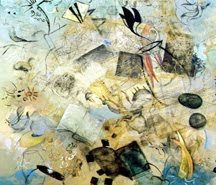
Here to the left is a painting I did years ago. There are many floating forms, and it has a crowded or busy feel to it. At the time I painted it I was trying to deal with lots of obligations in my life – not enough time spent alone.


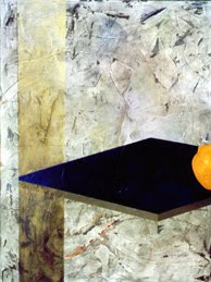
Then I painted the one below. It’s hilarious to see that I have actually pushed the forms off the canvas, but still hanging on "stage" at the far right edge. At that time I was spending more time alone in my studio.


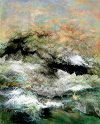
Now I am meditating much more on a daily basis, especially before I paint, and my current work feels like its all “charged space”, and in fact I like calling them “energy fields”.
Labels:

Tuesday, September 2, 2008

Bad Photos Add Inspiration

A good painter and friend of mine, Ines Kramer, told me she likes to take bad photographs. She actually plans a few long distance trips each year just to take them. I thought she was just being self effacing, until I realized the full impact of what she was saying. Ines uses the photos in her work, by photoshopping them, cutting them up and collaging them onto a surface as an underpainting, and then adds paint on top sometimes obliterating the images, often changing their shape, color, etc. She said that if the photographs are too good she doesn’t feel as free to change them. A good photo keeps her from adding her own ideas, while a bad photo just asks to be changed, rearranged, and given personality. Another artist friend of mine, Martha Kennedy, paints beautiful landscapes with (as she puts it) “mouth-watering colors”. She showed me her photographs she uses as reference. They are really downright BAD! I mean, these are photos with no contrast that look like the camera missed the boat on light exposure. These are the ones I would throw away. The difference between her paintings and the original photo are so vast that it’s hard to even imagine a connection. When I look at her work, the colors are truly “mouth-watering”. (By the way, even Martha’s car is painted a mouth-watering apricot – very cool). I was just pondering these strange methods from my friends, as I spent the last two days in my studio going through piles of photographs I had taken over the years, to get some new ideas. One of my favorite things to do is to take some time to look at images and recrop in new ways. I have a scissors nearby and cut up parts of photos that I shot, and combine them with other parts of other photos – sort of mixing up images to create some new ideas. I kept gravitating towards the beautiful photos. Photos from the Bosque del Apache, a bird reserve in New Mexico, with gorgeous sunsets, skies and mountains – just bursting with beautiful color palettes. I only went for the GOOD photos. But while painting from them, it’s a bit more difficult to change what already works so well. I find myself in a “copy” mode – instead of using the skimpy weak references, like my buddies, which beg for more. I see that when there’s something missing in the photo, it just begs us to add our own inspiration.

Labels: